The electronic workbook, Third Class County Budget Trend Analysis: 1996–2013, is a set of spreadsheets, or workbook, that enables Missouri third-class counties to analyze county fiscal trends from 1996 to 2013. A county can make a detailed study of its budget and fiscal performance to identify factors contributing to fiscal stress and to consider actions it might want to take. The workbook also allows a county to benchmark itself against a set standard, its own past performance or the record of another county as a gauge of fiscal performance.
This manual is divided into three main sections:
- It begins with a general discussion of trend analysis and benchmarks.
- The second section discusses interpretation of each graph, using actual examples from third-class counties.
- The final section is a tutorial for using the electronic workbook. If you are not familiar with using drop-down boxes in an Excel spreadsheet, you might wish to turn to that section first for a refresher on using the workbook. As soon as you open the workbook file, we suggest you make and save a copy as a backup. Use that backup copy if the file you are using is damaged.
The budget data in the workbook come from the Office of the Missouri State Auditor. Data for 1996 to 2004 come from the published Third Class County Audits, and data for 2005 to 2013 are from spreadsheets obtained from the auditor’s office. The data on assessed property values and taxable sales are from the Missouri State Tax Commission and the Missouri Department of Revenue. The Municipal Cost Index is from American City and County Magazine. Population and income data are from the Bureau of Economic Analysis of the U.S. Department of Commerce. The Consumer Price Index is from the Bureau of Labor Statistics, U.S. Department of Labor.
Budget analysis
When a county builds its budget each year, it has options for analysis. Many counties build a new budget using the previous year’s budget as a base and then increase or decrease revenue and expenditure projections for individual items. Taking a longer-term view of trends in a county’s total revenues and expenditures and in individual budget items might offer additional insights. This analysis can be useful for several purposes, such as to determine whether a drop in revenues is a short- or long-term issue. Further insights might be gained by comparing the fiscal performance of carefully chosen counties.
This manual accompanies MU Extension publication DM4011, Third Class County Budget Trend Analysis 1996–2013, an electronic workbook designed to enable third-class counties to make such comparisons. The graphs in the workbook are for the General Revenue Fund. The data for the Road and Bridge Fund and the totals of the Special Sales Tax Funds are included in the data sheets but are not graphed. Because these funds rely on the same tax bases as the General Revenue Fund, their general trends will be similar to those of the General Revenue Fund.
Numbers by themselves tell only part of the story. Understanding what is behind the numbers is equally important. In this manual, we will suggest possible interpretations of trends and anomalies, but local knowledge is needed to understand the full story. The numbers might also suggest questions to be investigated further.
If data are missing for a year, data in the workbook will show a blank and the graph will show zeros. Data show a zero if the county does not have a given tax or expenditure or if the expenditure is financed with a special tax rather than out of general revenues.
The annual budget
For a given year, it is possible to analyze how the budget is allocated among various functions or how much each revenue source contributes to the budget. This is an indicator of the importance of an expenditure or revenue source for the county. For example, a pie chart helps depict how the various components of revenues or expenditures contribute to the total. A pie chart shows percentages of total revenues or expenditures from individual items. The graphing software also includes dollar values on the chart. Examples of pie charts for expenditures and revenues can be found in the sheet labeled County Budget Trends.
Trend analysis
A trend tracks a budget item over time. In the workbook, a trend might be measured as the total value, the per capita value, or the percentage change in revenues, expenditures or tax bases. Trend analysis provides four ways for a county to examine its fiscal trends:
- Trends in the dollar value of total or individual expenditures, revenues or tax bases can be examined over the 1996–2013 period.
- The growth rates of total or individual expenditures, revenues or tax bases can be examined using annual or cumulative growth rates over the 1996–2013 period.
- Total or individual expenditures, revenues or tax bases can be examined on a per capita basis over the 1996–2013 period.
- Real (adjusted for inflation), total or individual expenditures, revenues or tax bases can be examined over the 1996–2013 period. The per capita graphs in the workbook use real dollars. All other graphs use current or nominal dollars.
Trend analysis of dollar amounts
A pie chart is useful for depicting the allocation of an annual budget, but it cannot show changes over time. An area chart, such as the one labeled County Detailed General Revenue Receipts in the County Budget Trends sheet shows how dollar values of receipts or revenues changed from 1996 to 2013.
Trend analysis of growth rates
Annual and cumulative growth rates provide another option for analyzing budgets. Using a growth rate allows comparison of budget items that differ in magnitude because they are both measured as percentages. For example, growth rates are useful when comparing sales tax base and sales tax revenues. Because revenues are a percentage of the base, if totals were graphed the revenues would be a flat line along the bottom, which does not convey useful information.
Annual growth rates
An annual growth rate compares the percentage change in an account or item from one year to the next.
Calculate an annual growth rate by subtracting the previous year’s value from the current year’s value and then dividing this number by the previous year’s value. This rate shows the percentage change from one year to the next. Using 2005 and 2006 as an example, the formula for the annual percentage change is (dollars in 2006 – dollars in 2005)/dollars in 2005. If the item is less in 2006 than it was in 2005, the percentage change is negative and the line on the graph will fall below zero.
Take care when interpreting an annual growth rate graph; it can be visually deceiving. A downward trend does not signify absence of growth, but rather that growth is not as fast as it was in the past. Only if the growth rate is negative — that is, when the line drops below zero on the graph — does it signify a decline in the total value of the tax base, the tax revenue or the expenditure.
An annual growth rate graph is especially useful for showing the volatility of a budget item or revenue source. Annual growth rates are used in the Base Trends sheet.
Cumulative growth rates
A cumulative growth rate compares the percentage change in an account from the base year to any given year, such as the percentage change from 1996 to 2000, or from 1996 to 2013.
A cumulative growth rate is calculated by subtracting the base year’s (1996) value from the given year’s value and then dividing this number by the base year’s value. This rate shows the cumulative change from the base year (1996) to the new year (for example, 2000) as a percentage of the base year’s value. The formula for the percentage change would be (dollars in 2000 – dollars in 1996)/dollars in 1996. For 1996, this number is 0 percent.
The cumulative growth rate implicitly uses 1996 as the benchmark. The graph of the cumulative growth rate shows how something has grown, not only from one year to the next, but also from the beginning to the end of the period of analysis. While the annual growth rate must fall below zero to indicate a decrease in the absolute amount, a simple decline in the cumulative growth rate indicates a decrease in the absolute amount.
Real dollar trend analysis
“A dollar doesn’t buy what it used to,” is a common refrain. To take the impact of inflation into account, nominal or current dollars are converted into real dollars by using an index of inflation. The inflation index for county revenues, expenditures and tax bases used in the workbook is the Municipal Cost Index, which is a weighted combination of the construction index, the producer price index and the consumer price index. The construction index is used to reflect changes in construction costs. The producer price index reflects changes in many operational and nonconstruction costs. The consumer price index is used to reflect wage costs. The weights reflect municipal costs, but this index is the closest to reflecting county costs. Personal per capita income is adjusted for inflation using the Consumer Price Index, the most common measure of inflation.
The graphs based on total dollar amounts in the workbook use current dollars, so the dollars can be read from the county budgets. The graphs in the County Real per Capita sheets use real dollars.
Per capita trend analysis
County populations change, and revenues or expenditures are affected by population changes. For this reason, comparing totals might not always give the complete picture of what is happening in the county. A per capita value is calculated by dividing the given expenditure, revenue or tax base by the number of people living in a county. Per capita analysis is a convenient way to compare county budgets, keeping in mind that a county’s population changes over time. Counties that are losing population might find their per capita costs increase because, for example, they must maintain the same number of miles of roads regardless of the population. The County Real per Capita sheet contains per capita graphs in real dollars.
Per capita comparisons are also useful if a county wants to draw comparisons to other counties. Comparing total dollar amounts between the two would be meaningless if the counties were not similar in size.
Fiscal benchmarks
At its simplest, a benchmark is a standard for comparison. To use a benchmark as a tool for evaluation, a county must have goals and set benchmarks for those goals. For budgets, goals might be a service that is provided at a chosen level, and the benchmark might be the cost of providing the service. For example, a county might use a benchmark to compare their costs to those of another county. Depending on the goals, there are several useful fiscal benchmarks:
- Absolute benchmarks, such as maintaining per capita expenditures at a given level for a certain service
- Measures of an account over time compared with a chosen year
- Comparisons with other counties
Spending less than $100,000 per year on buildings and grounds is an example of an absolute fiscal benchmark. This type of benchmark sets an upper limit that is not to be exceeded. Alternatively, the benchmark could be to spend at least $300,000 on the sheriff’s department. These types of benchmarks should be used with caution. For example, setting a benchmark of less than $50,000 per year on jail expenditures could put the welfare of county residents at risk. Alternatively, setting a minimum expenditure could result in overspending. The state auditor’s recommendation that counties carry cash balances of approximately 30 percent of expenditures is an example of a useful absolute benchmark. Other examples of absolute benchmarks include certain financial ratios that are used to measure management practices.
A trend analysis that looks at how receipts and expenditures have changed over a chosen period of time is another type of benchmark. In fact, trend analysis is often used for benchmark analysis. For example, if a county’s expenditures on fringe benefits accounted for 10 percent of the county budget in 2008 but increased to 15 percent of the budget in 2009, the county might want to investigate the cause of the change.
The last type of benchmark is a comparison with other counties. The county comparisons can be made using the County-to-County Budget Trends, County-to-County Base Trends and County-to-County per Capita sheets in the workbook.
Counties can draw comparisons with a neighboring county, a county of similar size or a particularly well-run county. Populations of third-class counties ranged from just over 2000 to nearly 54,000 persons in 2013, so the comparison might be meaningless without accounting for population differences. For example, Howard County spent $182,302 on health and welfare in 2009, whereas Lawrence County spent $531,085, almost three times as much. Accounting for population, Howard County spent about $18.51 per resident and Lawrence County spent $14.11 per resident on health and welfare in 2009. Comparing Howard County to a county with similar population might be more useful. Per capita measurements can obscure certain details, such as base costs that do not differ significantly with population differences. For example, once a jail is built, certain costs are necessary whether the jail is empty or full.
Another option is to choose a well-managed county with a similar population. With the comparative approach, any of these comparisons can be used as a benchmark for evaluating county budgets. Once the comparison is made, a county can use the information in choosing what action, if any, it wants to take in its budgeting practices.
Using the charts in the workbook
If you have not yet opened the workbook, you might want to go to the final section of the manual for a tutorial. Be sure to make a copy of the original and store it so that if the workbook is damaged, you have an easily accessible copy.
Budget trends
The following explanation of the charts in the County Budget Trends sheet uses Audrain County as the example.
This sheet includes the following charts:
- 2013 General Revenue Receipts
- 2013 General Revenue Expenditures
- General Revenue Receipts and Expenditures
- General Revenue Cash Balance
- Detailed General Revenue Receipts
- Detailed General Revenue Expenditures
Audrain County 2013 General Revenue Receipts
The pie chart provides a simple depiction of the proportion of Audrain County’s general revenues collected from each of the six revenue sources: sales tax, property tax, intergovernmental transfers, charges for services, interest and other (Figure 1). The chart provides both the dollar amount and the percentage of general revenues from each source. A diverse mix of receipts tends to provide more stable revenues because the county is not completely dependent on any single source of revenue affected by the economy, such as declining sales or property values. Property taxes are generally a more stable source of revenue than sales taxes, but when property values fall, they might be slower to recover than sales tax revenues.
The chart illustrates that Audrain County generates small amounts from interest and from other revenues. Property taxes account for 20 percent of revenues; sales taxes, 55 percent; intergovernmental revenues, 12 percent; and charges for services, 12 percent.
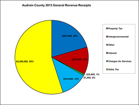 Figure 1
Where do most of the receipts come from? Does the county have a diversified revenue base or is it concentrated on only one source?
Audrain County 2013 General Revenue Expenditures
The pie chart shows eight general revenue expenditures: general government, law enforcement, court, fringe benefits, prosecuting attorney, public administrator and coroner, health welfare and “other,” and operating transfers (Figure 2). These categories were merged from the 20 categories found in the Missouri State Auditor’s report.
The eight categories were created based on recommendations from local officials because 20 categories could not be easily displayed.
- General Government includes the county commission, county clerk, elections, buildings and grounds, treasurer, collector and recorder.
- Law Enforcement includes the sheriff and jail.
- Court expenditures include the circuit clerk, associate clerk, court administration and juvenile officer.
- Health and Welfare is combined with “Other.”
- Public Administrator and the Coroner are combined.
- Fringe Benefits.
- Prosecuting Attorney.
- Operating Transfers were not aggregated.
The disaggregated data can be found in the data sheets in the workbook.
Each category also displays the amount and percentage spent. A county might want to examine each in detail and question whether expenditure levels appear reasonable. For example, operating transfers make up 33 percent of Audrain’s expenditures, but operating transfers typically make up a small percentage of a county budget. It might be prudent to inquire why this expenditure category is so large and where the transferred funds are used. It is also possible that the county transfers general revenues to funds set aside for specific purposes. It is also notable that law enforcement accounts for 0 percent of Audrain’s general revenue expenditures, and it appears that special sales taxes are used to fund certain expenditures, including law enforcement.
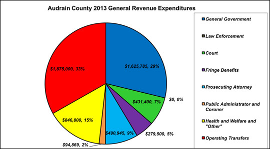 Figure 2
Examine the pie chart. Where are most of the expenditures going? Are any of the expenditures larger or smaller than expected?
Audrain County General Revenue Receipts and Expenditures
The line chart depicts the relationship between Audrain County’s expenditures and receipts, 1996–2013 (Figure 3). These are nominal or current dollars, meaning they have not been adjusted for inflation. There is an upward trend in the growth of expenditures and receipts. Revenues exceed expenditures in some years, and it appears the county is “saving” for certain projects done in years when expenditures exceed revenues. It is important to note that Missouri counties are bound by law to have a balanced budget. This explains why receipts and expenditures tend to remain close. Cash balances from a previous year might be used to finance expenditures in later years.
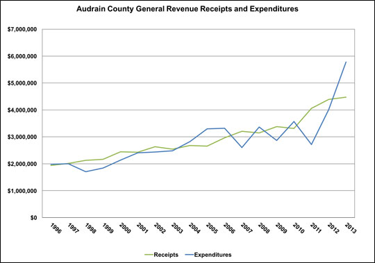 Figure 3
Examine the chart to identify times when expenditures are greater than revenues and notice trends. Is the budget growing, shrinking or steady?
Audrain County General Revenue Cash Balance
The line chart traces the size of Audrain County’s cash balance from one year to the next (Figure 4). A cash balance helps buffer potential budget shortfalls. Missouri third-class counties tend to have a cash balance capable of covering about three months’ worth of future expenditures (Missouri Auditor’s Report, 2005). Audrain frequently had a more than six-month budget surplus. As can be seen, the cash balance shrank between 2004 and 2006 but is now rebuilding. A declining cash balance might be a sign of fiscal stress or indicate the county used it on a project.
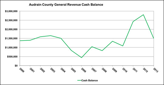 Figure 4
Examine the chart for trends. Think about why the cash balance changes over time. Are the balances becoming larger or smaller over time?
Audrain County Detailed General Revenue Receipts
The pie chart provides a one-year snapshot of Audrain County’s general revenue receipts. The area trend chart shows the sizes of those receipts and how they have changed from 1996 to 2013 (Figure 5). The six categories are the same as those used in the pie chart: sales tax, property tax, intergovernmental transfers, charges for services, other and interest. Note that the numbers do not take into account inflation or population growth.
Rapid growth and slow or zero growth can raise questions for local officials. A large change that lasts only one year might indicate an error in the data, or it might indicate an unusual year with a one-time expenditure. Only investigation can determine which is the case. (See the Data problems section if you need to correct a data error.)
Referring to the graph and the data table, property tax revenues have shown steady growth. Sales taxes were a larger percentage of revenues but grew slowly until 2011. Sales tax revenues grew rapidly in 2011, suggesting an increase in the tax rate. The increase is too large to be due only to business openings. Was the increase in property tax revenues due to increasing property values — an indicator of growth in the county — increasing tax rates, or both?
Intergovernmental transfers grew steadily, then decreased, but started increasing again in 2012. A question for consideration is whether cuts in state funding in the future might potentially leave the county vulnerable.
Charges for services also grew until 2011. Was this a result of a decision by the county to increase fees or to acquire or offer a new service for which fees are charged?
Audrain County’s mix of revenues was relatively stable until 2011 when sales tax revenues become a much larger share. Other counties also exhibit shifting in the mix of receipts. Officials might want to consider whether changes in the revenue mix will make the county more or less fiscally stable, and if the changes prepare the county for future economic recessions?
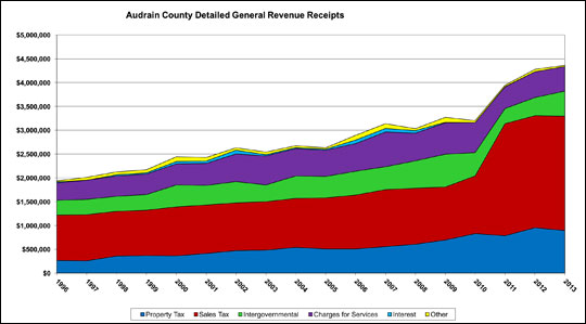 Figure 5
Examine trends and look to see if the receipts are growing or shrinking. Are any of the receipt trends surprising?
Audrain County Detailed General Revenue Expenditures
Like the revenue chart, this chart shows the size of expenditures and how they changed during the period from 1996 to 2013 (Figure 6). The eight categories are the same as those used in the pie chart: general government, law enforcement, court, fringe benefits, prosecuting attorney, public administrator and coroner, health and welfare and other, and operating transfers. Again, these numbers do not account for inflation or population growth, and a large change that lasts only a year might indicate either a one-time expenditure or a data error. Investigate further to determine which it is.
Audrain County’s funding for law enforcement expenditures dropped to zero in 1998. This is probably due to either a new special sales tax measure or an increase in an existing special sales tax levy, which shifted funding from the General Revenue Fund to a dedicated fund.
Operating transfers increased significantly, growing from zero in 1996–1997 to $1.3 million in 2008 and $700,000 in 2009. Is this a fiscal concern? Is it simply a question of how to account for certain expenditures for which the budget sets up a separate fund?
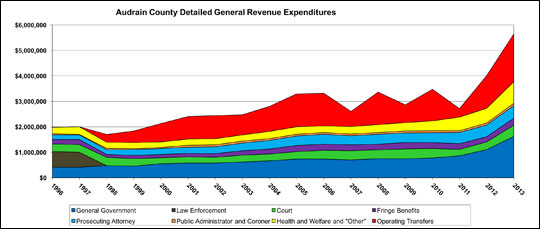 Figure 6
Examine trends for major changes in spending over time. Are any of the trends different than expected?
Trend analysis: Base trends
The following sections explain how to interpret the charts found in the County Base Trends sheet, using Audrain County as an example.
The six charts are:
- Tax Bases: Property Assessed Values and Taxable Sales
- Per Capita Tax Bases: Property Tax Assessments and Taxable Sales
- Annual Growth Rates: General Revenue Property Tax Receipts and Property Assessed Values
- Annual Growth Rates: General Revenue Sales Tax Receipts and Taxable Sales
- Cumulative Growth Rates: General Revenue Property Tax Receipts and Property Assessed Values
- Cumulative Growth Rates: General Revenue Sales Tax Receipts and Taxable Sales
Audrain County Tax Bases: Property Assessed Values and Taxable Sales
This chart shows the trend in the property tax and sales tax bases for Audrain County (Figure 7). The small peaks and valleys in the property assessed values every few years are probably due to the reassessment cycle. The largest increase, in 2007, could be due to a business location or a general increase in property values. There is steady growth of the property tax base from then until 2013. This demonstrates a common characteristic of the property tax. The taxable base tends to be stable; it neither increases nor decreases quickly.
The blue line indicates that taxable sales were flat until about 2004, when they began to increase. Taxable sales fell between 2009 and 2010, most likely due to the economic recession. Taxable sales have not recovered to their pre-recession level. A county with slow growth in taxable sales might investigate the reasons — such as slow population growth or population loss, slow income growth, increased “outshopping” (purchases made online or outside the local area) by residents, or loss of retailers.
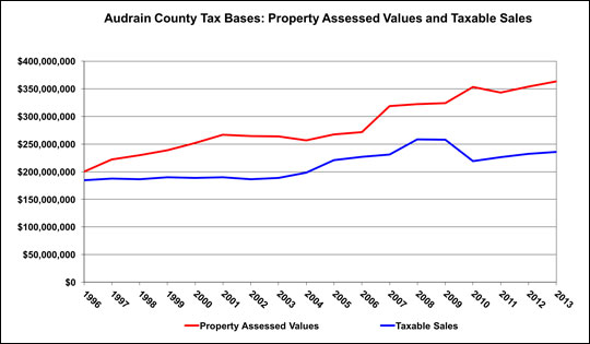 Figure 7
This chart compares the property and sales tax bases total values over time.
Audrain County per Capita Tax Bases: Property Tax Assessments and Taxable Sales
Property values are a reflection of the economic activity in an area. The property tax base tends to respond more slowly to changes in economic activity than taxable sales, making it a more stable tax base.
Population estimates can be found in the Population and Income and County Real per Capita sheets. Population and Income shows that Audrain’s population has been quite stable from 1996 to 2013, with a loss of just several hundred from its peak.
If the tax base is decreasing per capita, economic growth is probably not keeping pace with population growth, so there are fewer resources per capita to provide public services unless tax rates are raised or cost-savings are instituted.
An increasing tax base per capita indicates one of two situations. In the first case, the tax base is growing faster than population, an indicator of economic growth. The second case is common in counties losing population; property values tend to move slowly, so assessed values are not decreasing as rapidly as population, leading to higher assessed values per capita. In the longer run, property values will probably decline because businesses begin to close and demand for housing is diminished. If property values decline more rapidly than the population, there will be declining property values per capita. This means the county will have less revenue per capita to provide services. A declining population can be a consequence of insufficient economic activity to maintain the population.
The chart indicates that assessed property values per capita increased most rapidly after 2006, when the county began losing population (Figure 8). The previous graph showed that property values increased during this period, but population decreased by several hundred people, causing an increase in property values per capita. Taxable sales per capita are flat until 2004 and show steady increase until the drop in 2010, likely as a result of the recession. As of 2013, they had not recovered to pre-recession levels.
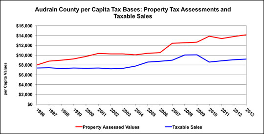 Figure 8
This chart compares the property and sales tax bases on a per-person basis. If there is growth, that means that the base is growing on a per person basis.
Audrain County Annual Growth Rates: General Revenue Property Tax Receipts and Property Assessed Values
This chart compares the annual growth rate of the property tax base and its revenues (Figure 9). Take care when interpreting an annual growth rate graph, as it can be visually deceiving. A downward trend means growth still occurs but is not as fast as it was in the past. Only if the rate is negative — that is, if the line drops below zero on the graph — does it mean there was a decline in the total tax base or total tax revenues.
Audrain County shows slowing growth of assessed values, which turns negative from 2002 to 2004. Then assessed values grow until 2011, and again in 2013. The somewhat regular small bumps in odd-numbered years are probably due to the two-year reassessment cycle.
The change in property tax receipts from one year to the next is more volatile than the tax base. Local officials might want to investigate why receipts are more volatile than assessed values.
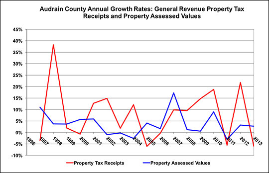 Figure 9
This chart compares the annual rate of growth of property tax revenues and the property tax base. If property tax revenues are growing faster than the property tax base, that means that there has been a tax rate increase, slow growth, or increased county needs.
Audrain County Annual Growth Rates: General Revenue Sales Tax Receipts and Taxable Sales
The sales tax base, or taxable sales, is typically less stable than the property tax base, and this is true in Audrain County (Figure 10). Because the base is volatile, receipts are also expected to be volatile. When the sales tax base and receipts move together, it implies the tax rate is constant. Here, receipts are more volatile than the base and do not appear to follow it closely. The large percentage increase in 2011 is probably due to a sales tax rate increase.
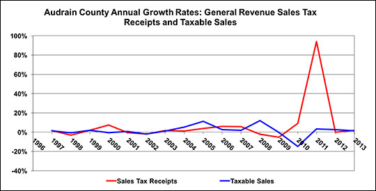 Figure 10
This chart compares the annual growth rate of sales tax revenues and the taxable sales base. If revenues grow faster than taxable sales base, a tax rate increase is making up for slow growth or declining collections.
Audrain County Cumulative Growth Rates: General Revenue Property Tax Receipts and Property Assessed Values
Whereas previous charts showed the annual growth rates of the taxes and their bases, this chart compares the cumulative growth rate of the property tax assessments and the tax receipts collected (Figure 11). A cumulative growth rate might offer a more intuitive and easier way to observe growth trends over time than an annual growth rate. The cumulative growth rate compares the growth rate from 1996 to any given year. Put another way, the cumulative growth rate is the sum of all previous annual growth rates.
In this chart, Audrain County has a relatively stable cumulative property tax assessment growth rate. Growth was faster from 2006 onward.
Property tax receipts grew at a faster rate than the assessed values, suggesting one or more tax rate increases. This pattern is common when populations are stable or declining.
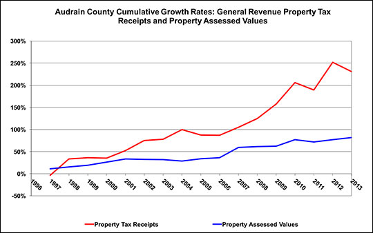 Figure 11
This is an alternative way to examine growth. It shows how the property tax base and its receipts have changed since 1996. That is, each year is shown as a percentage of 1996.
Audrain County Cumulative Growth Rates: General Revenue Sales Tax Receipts and Taxable Sales
Sales tax receipts grew slower than taxable sales from 2007 to 2009, suggesting a tax rate decrease (Figure 12). The increase of receipts in 2011 suggests a tax rate increase.
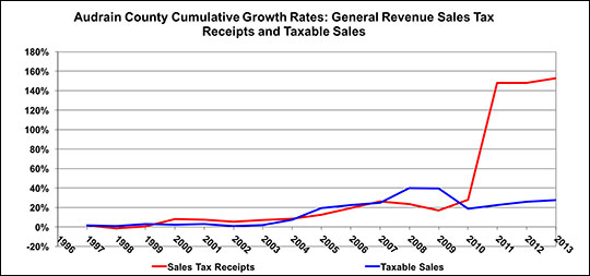 Figure 12
This chart offers an alternative way to examine growth. It shows how the sales tax base and its receipts have changed since 1996. That is, each year is shown as a percentage of 1996. When receipts grow faster than taxable sales, it indicates a likely tax rate change.
County real per capita trends
The following sections explain how to interpret the charts found in the County Real per Capita sheet, using Audrain County as an example. The previous charts did not take inflation into account, and only the per capita chart in the County Base Trends sheet took population into account. This sheet adjusts for both inflation and population.
As a county’s population grows, one might expect total property values and taxable sales to increase, resulting in an increase in tax revenues. If the bases increase faster than population, there will be an increase in per capita tax bases and per capita taxes (if tax rates are constant). If the bases increase more slowly than population, there will be a decrease in per capita tax bases and a decrease in tax revenues per capita.
Conversely, if a county is losing population, its tax bases might decline more slowly than population, leading to an increase in both the base and taxes per capita. If the base declines more rapidly than population, this will lead to a decline in the per capita base and per capita taxes. Thus, an increasing or decreasing base per capita must be investigated to determine the factors driving the change. An increase in bases per capita might be due to increased assessed values or decreased population.
Areas losing population face the common problem that there is an increase in per-person service costs. For example, a water plant has a fixed capacity and will incur approximately the same operating costs even as population declines. Many counties respond to this dilemma by increasing tax rates or user fees, so in a scenario of depopulation, each person might pay more to sustain the current level of service.
Tax bases or revenues might appear to be growing, but they need to grow at least as fast as inflation to be able to purchase the same amount of goods. In a slow-growing county, tax bases and tax revenues might not grow as fast as inflation. This might result in fiscal stress for the county, because the costs of what the tax revenues can purchase will increase. All current or nominal dollars are converted to the equivalent of 1996 dollars, using the Municipal Cost Index as the index of inflation. While the index is for municipalities, as discussed above, it is the only index available for local governments and is probably a better fit for counties than the Consumer Price Index alone.
The following charts are included in this sheet:
- County Population
- Real per Capita Income
- General Revenue Receipts and Expenditures: Real per Capita
- General Revenue Tax Bases: Real per Capita
- General Revenue Property and Sales Tax Receipts: Real per Capita
- Detailed General Revenue Receipts: Real per Capita
- Detailed General Revenue Expenditures: Real per Capita
Audrain County Population
Audrain’s population in 1996 was just under 25,000 (Figure 13). There was relatively strong growth for several years before the population leveled out. The population declined in 2003 and 2004, which was a period of recession, and then grew again. Population has fallen since 2006 and is several hundred below the high point in 2006. Factors that contributed to the periods of growth and the periods of decline might be investigated.
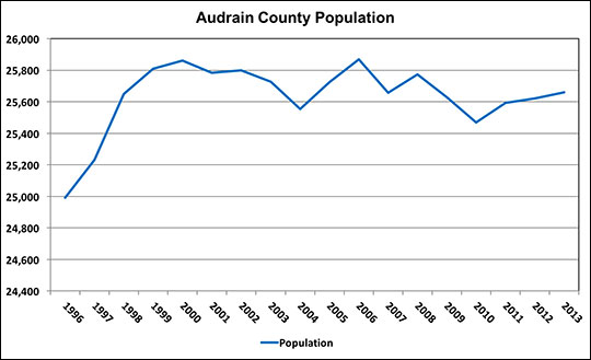 Figure 13
Is the population declining, growing, stable or showing volatility? Each type of trend has different management challenges.
Audrain County Real per Capita Income
Per capita income is presented in current dollars and adjusted for inflation using the consumer price index (Figure 14). There is volatility in real per capita income in Audrain County, with fluctuations of up to $1,000 per capita from one year to the next. For a family of four, this would be a $4,000 change in the purchasing power of family income. The drop in 2002 is in part due to a recession. The recession drop in 2009 was smaller than in 2002. Even with the volatility, real per capita income increased from 1996 to 2013.
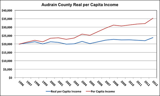 Figure 14
The trend in real per capita income shows if purchasing power is increasing, decreasing or stable. The difference between these trends illustrates why it’s important to think about the purchasing power of income.
Audrain County General Revenue Receipts and Expenditures: Real per Capita
This graph illustrates that Audrain County’s real general revenue receipts show volatility with increases some years and decreases in others (Figure 15). This volatility makes management of the budget difficult.
Per capita real expenditures show more volatility than revenues. This might indicate fiscal stress and the need to use cash balances or that the county was planning a one-time expenditure for which it used the cash balances accumulated in previous years.
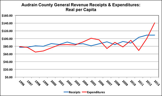 Figure 15
Examine the chart to identify times when real per capita expenditures are greater than revenues and notice trends. Think about how this compares with the earlier graph with total receipts and expenditures.
Audrain County General Revenue Tax Bases: Real per Capita
Audrain’s real property tax base per capita increased until 2001 and then decreased through 2006 (Figure 16). Since that time, it has displayed more volatility than in previous years. The real taxable sales per capita have also declined. Though they showed recovery in the mid 2000s, they are now lower than in 1996. The decline of the real tax bases per capita suggests that Audrain County might be facing fiscal stress.
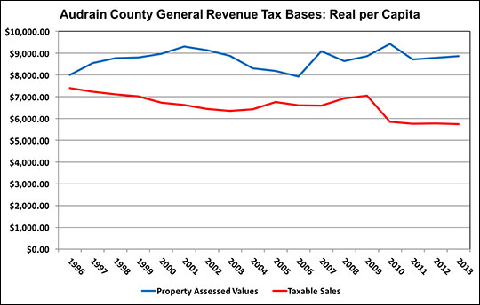 Figure 16
Examine the chart to see the implications of the purchasing power per capita of the tax bases. Are the tax bases growing, stable or declining in purchasing power per person?
Audrain County General Revenue Property and Sales Tax Receipts: Real per Capita
Real property tax receipts per capita follow a trend similar to that of the property tax base. But it should be noted that there were years when the base fell but revenues did not, suggesting that tax rates might have increased. The need to raise tax rates to maintain services might be a sign of fiscal stress.
Real sales tax receipts per capita declined until 2010. The large increase in real per capita receipts in 2011 suggests a tax rate increase (Figure 17). Declines could be due to loss of businesses, consumers shopping outside the county, both consumers and businesses using the internet for purchases, or persons who used to come to Audrain to shop now shopping elsewhere.
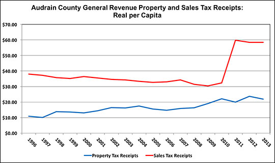 Figure 17
Look at the trend of receipts and compare to the chart of tax bases. Large increases in real receipts per capita suggest a tax rate increase.
Audrain County Detailed General Revenue Receipts: Real per Capita
The overall trends in this graph are similar to those in the County Budget Trends sheet, but the magnitudes are much smaller because they are per capita and adjusted for inflation (Figure 18). The trends for property tax and sales tax are the same as those displayed in the previous line graphs in this sheet. Given the amount of information in the graph, it is also useful to look at the table of revenues, which shows that all of the real revenues per capita have volatility, which is difficult to see in the graph.
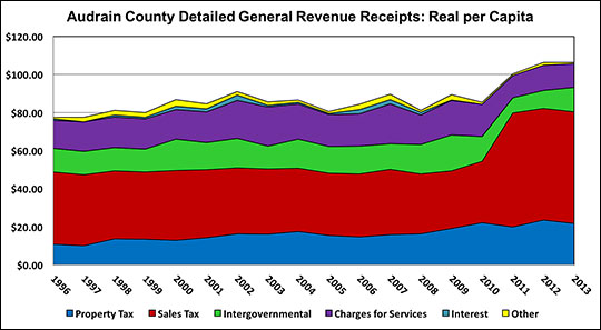 Figure 18
Examine trends to see if the purchasing power of each type of revenue per capita is growing, shrinking or stable. Are any of the receipt trends surprising?
Audrain County Detailed General Revenue Expenditures: Real per Capita
Costs for purchases increase with the rate of inflation. If tax bases per capita are not keeping pace with inflation, a county will have difficulty financing its normal services. Audrain County made an adjustment to cease funding law enforcement completely from general revenue (Figure 19). The large operating transfer, which increased at the time of the removal of law enforcement from the general fund, might indicate that some general funds are being transferred to the law enforcement fund. Health, welfare and other real spending per capita has also decreased. General government real spending per capita has increased the most. It is important to investigate the trends to learn the causes of increasing expenditures. It could be maintenance, mandates and citizen demands for services.
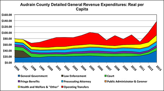 Figure 19
Examine trends in real spending per capita in each expenditure category. Think about why there are changes in individual real per capita expenditures.
Benchmarking using county-to-county budget comparisons
The county-to county sheets contain the same graphs as the previous three sheets, allowing for easy comparison of two counties. A county can choose to compare itself with a neighboring county, a county of similar size or a particularly well run county.
Choosing the appropriate comparison is important, such as counties with similar populations or value of tax bases. The comparison might be meaningless without accounting for population differences. Recall that per capita measurements can obscure certain details, such as base costs that do not differ significantly with population differences. A comparison of Livingston and Macon counties could be useful, as they begin with similar populations and tax bases.
Another option is to choose what is considered to be a well-managed county with a similar population. With the comparative approach, any of these comparisons can be used as a benchmark for evaluating county budgets. Once the comparison is made, a county can use the information in choosing what action, if any, it wants to take in its budgeting practices.
In all cases, the reason to make the comparison is to gain insight into the reasons for similarities and differences between the counties being compared.
Summary
The workbook is a tool for use by government officials in Missouri third-class counties as they assess long-term budget trends and benchmark a county’s performance with that of another. The graphs are meant to raise questions, and investigating those questions might provide insight into the county budget and the factors that influence it, including the local economy, population change and particular characteristics of a county and its residents.
When comparing counties, recall that despite similarities between any two counties, each has unique needs that vary from year to year. With careful interpretation of this data, this workbook can be a useful guide in helping counties achieve their fiscal goals.
How to use this workbook
The Excel file, Third Class County Budget Trend Analysis: 1996-2013, has fiscal analyses in six tabbed sheets.
- County Budget Trends
Individual county budget trends in the general revenue receipts and expenditures - County Base Trends
Individual county trends for property tax receipts and their base, as well as the sales tax receipts and their base - County Real per Capita
Individual county tax bases and budget trends on a per capita basis, controlling for inflation - County-to-County Budget Trends
Allows a county-to-county comparison of the general revenue receipts and expenditures budget trends - County-to-County Base Trends
Allows a county-to-county comparison for both the tax receipts and their tax bases - County-to-County Real per Capita
Allows a county-to-county comparison of tax bases and budget trends on a per capita basis, controlling for inflation
To review county fiscal data and trends
- Click the tab for the County Budget Trends sheet.
- In the cell below the County Selection Box, click the green cell at the top-left of the screen. A little box with a black arrow appears on the right side of the green cell.
- Click the arrow to display a list of the third-class counties. (Lincoln County is included because it was third-class until 2009.) We apologize that the font is so small but were not able to make it larger.
- Click the scroll bar to the right of the list to scroll through to the appropriate county.
- Click the appropriate county. The numbers in the tables and charts will update and include the name of the selected county in the titles.
- Scroll right and down to view the available charts.
The process can be repeated for any of the other trend sheets by clicking those tabs for the sheet at the bottom of the page and repeating the process above.
To print a graph
- Select a graph by clicking on it once.
- Click the File tab, then select Print.
- In Print settings, select Print Selected Chart.
- Click Print Preview before printing to see if the chart will print as you want.
Data sources
The budget data are from county budgets. The budget sheet and cell for each data item are given in the Data Sources sheet of the workbook. The data are presented in the following sheets at the end of the workbook:
- Property Base
- Sales Base
- 3-A GF Receipts and Balances
- 4 GF Expenditures
- 3-B Road Fund
- Special Sales Tax
- Population and Income
- Price Indices
General data sources
- Regional Economic Information System. Local Area Personal Income. Bureau of Economic Analysis, U.S. Census Bureau. Accessed April 12, 2011.
- Missouri Department of Revenue. Taxable Sales. Accessed April 12, 2011. (No longer available online. See https://dor.mo.gov/taxation/business/tax-types/sales-use/
- Missouri State Tax Commission. Assessed values were obtained from spreadsheets from the office.
- Missouri State Auditor’s Office. Missouri 3rd Class Counties. Jefferson City, Mo. Various years.
- Missouri State Auditor’s Office. 2004-2013 data were obtained in spreadsheets from the Office.
- Penton Media, Inc. Municipal Cost Index. American City and County. 2011. Accessed July, 2014. (No longer available online.)
Data problems
Substantial portions of the data are unaudited and cannot be guaranteed to be accurate or complete. The Specific County Data Notes sheet lists issues with specific budgets or when a budget is not available for a county.
The data in these sheets are protected to avoid inadvertent data corruption. However, if you suspect there is an error, you can correct the data by following the instructions below.
To correct the data, first make sure you have saved a copy of the workbook. If you make a mistake, you can go back to the original, make another copy and try again.
- Right-click the tab of the sheet.
- Click Unprotect in the drop-down menu.
- Select the cells containing errors by right-clicking and highlighting the cells.
- Move the cursor over the highlighted cells and right-click.
- Select Format cells in the drop-down menu.
- Click the Protection tab.
- Click the box next to the locked option to unlock it.
- Click Ok.
- Correct the data.
- Return to the charts to review and make sure they have been recalculated.
- Repeat this process to lock the cells that were corrected and to protect the sheet.
Be careful when making changes to the data that you don’t make unintended changes. Once you have made a change, store a copy of that workbook. Record any data corrections that were made in the Notes sheet in the workbook.
If you find an error, please contact the authors at stallmannj@missouri.edu so we can update our data records.
Charts in the workbook
Budget Trends
- County 2013 General Revenue Receipts
- County 2013 General Revenue Expenditures
- County General Revenue Receipts and Expenditures
- County General Revenue Cash Balance
- County Detailed General Revenue Receipts
- County Detailed General Revenue Expenditures
Base Trends
- County Tax Bases: Property Assessed Values and Taxable Sales
- County per Capita Tax Bases: Property Tax Assessments and Taxable Sales
- County Annual Growth Rates: General Revenue Property Tax Receipts and Property Assessed Values
- County Annual Growth Rates: General Revenue Sales Tax Receipts and Taxable Sales
- County Cumulative Growth Rates: General Revenue Property Tax Receipts and Property Assessed Values
- County Cumulative Growth Rates: General Revenue Sales Tax Receipts and Taxable Sales
County Real per Capita
- County Population
- County Real per Capita Income
- General Revenue Receipts and Expenditures: Real per Capita
- General Revenue Tax Bases: Real per Capita
- General Revenue Property and Sales Tax Receipts: Real per Capita
- Detailed General Revenue Receipts: Real per Capita
- Detailed General Revenue Expenditures: Real per Capita
County-to-County Budget Trends
- County #1 2013 General Revenue Receipts
- County #2 2013 General Revenue Receipts
- County #1 2013 General Revenue Expenditures
- County #2 2013 General Revenue Expenditures
- County #1 and #2 General Revenue Receipts and Expenditures
- County #1 and #2 General Revenue Cash Balance
- County #1 Detailed General Revenue Receipts
- County #2 Detailed General Revenue Receipts
- County #1 Detailed General Revenue Expenditures
- County #2 Detailed General Revenue Expenditures
County-to-County Base Trends
- County #1 and #2 Tax Bases: Property Assessed Values and Taxable Sales
- County #1 and #2 per Capita Tax Bases: Property Assessed Values and Taxable Sales
- County #1 and #2 Cumulative Growth Rates: General Revenue Property Tax Receipts and Property Assessed Values
- County #1 and #2 Cumulative Growth Rates: General Revenue Sales Tax Receipts and Taxable Sales
County-to-County Real per Capita
- County Population
- County Real per Capita Income
- General Revenue Receipts and Expenditures: Real per Capita
- General Revenue Tax Bases: Real per Capita
- General Revenue Property and Sales Tax Receipts: Real per Capita
- County #1 Detailed General Revenue Receipts: Real per Capita
- County #2 Detailed General Revenue Receipts: Real per Capita
- County #1 Detailed General Revenue Expenditures: Real per Capita
- County #2 Detailed General Revenue Expenditures: Real per Capita