Chapter 11 of the  Missouri Master Gardener Core Manual
Residential landscaping can be defined as the art and the practice of improving the appearance and aesthetic appeal of the area surrounding a home. Each home and its landscape should be a reflection of the people who live there. It represents a visitor’s first impression of the home and its inhabitants. When first seen, it should be inviting and direct the guest easily to the front door. Additionally, the landscape should be functional. An attractively landscaped home not only offers pleasure to the family living there, it also improves the neighborhood and adds to the value of the property.
The purpose of this chapter is not to be a formula for the development of the landscape, but rather a guideline to planning and making choices, along with an explanation of the principles involved in designing a landscape.
Design principles
Landscaped correctly, the property surrounding a home will be attractive all four seasons of the year. Incorporating a few basic design principles will give the landscape unity, balance and interest throughout the year.
Unity
Unity in the landscape refers to the perception that all the components of the design work together in harmony. When the landscape is unified, there is a sense that everything in the landscape is part of the big picture and that all the elements work well together. Unity is achieved by selecting plants that complement each other, placing and grouping those plants effectively and repeating elements in the design.
Balance
Balance is the perception of equality in the landscape. When a front yard has several trees, shrubs or decorative elements on one side and only a few on the other, a feeling of imbalance is created in the viewer. This inequality of elements in the landscape lessens the curb appeal because it makes the area appear out of order.
The two main types of balance used in landscape design are symmetrical balance (Figure 1, top) and asymmetrical balance (Figure 1, bottom). Both create an overall sense of equality in the landscape, but in different ways. Symmetrical balance is achieved by planting and arranging all elements of the landscape in a mirror image. If a line were drawn down the middle of a space, symmetrical design would have identical placement and choice of plants and other materials on both sides. Symmetry is reasonably easy to achieve and gives a formal character to the landscape. Therefore, it is most appropriate for houses that are traditional or formal in character or symmetrical in shape (front door in the middle of the house with the exact number and placement of windows on both sides).
Asymmetrical balance is less structured. Asymmetry relies more on an intuition of balance rather than any formula or rules. One way of understanding asymmetrical balance is to imagine a large spherical weight placed on the left side of a balancing scale. To balance the right side without using an identical weight (which would result in symmetrical balance), several smaller weights would be required. Asymmetrical balance is created by careful placement of unequal elements.
Landscape with an asymmetrical design feels more informal and casual than symmetrical balance. It is appropriate for houses and owners whose character reflects a more relaxed attitude. Although asymmetry would appear to be the easier balance to achieve, it actually requires more thought and planning to be effective.
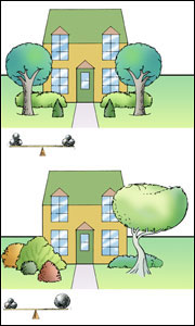 Figure 1
Symmetrical, formal balance depends on mirror images (top). Asymmetrical balance juxtaposes elements with different weights in a way that "feels" right (bottom).
Interest
Interest helps create visual appeal. In general, the primary focal point in the front yard should be the entry to the house. Carefully selected specimen plants or interesting effects can be used to strengthen or reinforce the importance of the front door. Effective placement of accents increases the interest of the design and can enhance the visual appeal. However, too many “attention-grabbers,” whether they be plants, statuary, or something else, result in a chaotic design and visual confusion.
Steps in residential landscaping
Develop base (plot) plan
A base plan shows property lines, house location, utilities (both above and below ground), all existing plant materials, walks, drives and topographic features such as rocks, streams, slopes or other characteristics of the grounds to be landscaped. Although exact scale is not necessary, try to obtain realistic proportions. Show dimensions for property lines, house outline and other permanent landmarks or structures (Figures 2, 3 and 4). This will be the base of future drawing that will be done on tracing paper placed over this plan.
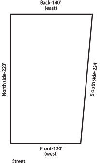 Figure 2
Measure property lines or boundary of area to be landscaped. Sketch roughly.
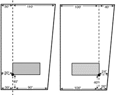 Figure 3
Sight along one side of house to locate points for positioning house on plan. Any corner may be used where objects do not interfere with sighting. For example, locate corner of house relative to a square corner of the lot (left) or an angled corner (right).
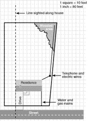 Figure 4
On the base plan, draw the lot, house and existing landscape features that will be retained.
Conduct site evaluation
Site evaluation is the first and one of the most important steps in residential landscaping. Before purchasing any plants or other landscaping materials and even before beginning to plan a design for the home grounds, it is essential to evaluate what already exists. If a new house is being constructed on a new lot, the landscaping plan should be developed in conjunction with the house plan. When planning to landscape an existing front yard, take inventory of what already is in place, what works in the landscape and what needs to be changed.
As the site is evaluated, consider the architectural style or character of the house. Is it one story or two (or more)? Is it rustic or formal, modern or traditional? One of the goals of effective landscaping is to draw attention to the house in much the same way that an attractive frame enhances a picture. The most effective landscape shows a definite relationship to the style of the house. The landscape should also reflect something of the character of those who live there.
Additional considerations when conducting a site analysis revolve around climatic and edaphic (soil-related) factors. The position of the sun relative to the house will affect it greatly throughout the year. The amount of shade cast from existing structures will limit somewhat the species of plants that can be used in the landscape. Prevailing wind is important in that strong winds tend to promote water loss. While soil can be amended, the current status of the soil (e.g., texture, structure, nutrient content) is important to know.
There are a number of places on a residential site where surface water needs to drain properly. In the front yard, those areas are the house, the driveway, entry walk and greeting area. Water should always be directed away from the house so that it does not stand around the foundation. The recommended slope is anywhere between 1 percent and 10 percent.
On any paved surface where people stand or walk or where objects are placed, water should be drained as quickly as possible so that the area can be used safely. Concrete and asphalt surfaces should have at least a 1 percent slope, while brick, stone and other rough pavement materials should have a minimum slope of 1.5 percent. At the same time, paved walks should not be steeper than a 5 percent slope, and driveways should not be steeper than 8 percent. The greeting area should not exceed 3 percent. Slopes beyond that percentage are perceived as having a definite slope and make a space feel unstable underfoot.
Determine family needs
List any outdoor features such as a patio, gardens, play areas or storage sheds that are envisioned for the area near the house. As space permits, sketch them on the base plan (Figure 5). Some of the features may not be included immediately but, as time goes by, interests may change and new features may be added or old ones removed. Develop the list for the present and near future. Include existing features on the list, and note which of those features are adequate and which could be improved.
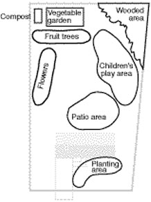 Figure 5
Lay a second sheet of tracing paper over the base plan and on it locate the desired landscape features. Try different arrangements and sizes of areas.
Identify use areas
Contemplating the development of a residential design can be overwhelming, especially if the property to be landscaped is large. For this and other reasons, it is useful to visualize the property as a group of individual areas. Each area serves a function and has its own landscape considerations (Figure 6).
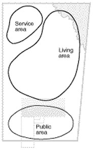 Figure 6
On tracing paper placed over the base plan, sketch approximate location of major landscape areas.
Public area
Generally, the front yard is considered the public area of the residence. This is the area visible from the front of the house and the street. It includes the walks, drive and front entrance and is designed to set off the house and make it more attractive and inviting to the visitor. As such, this area has two primary functions: presenting an attractive appearance to the neighborhood and getting people safely and easily from the street to the front door. Depending on the residents and the area, the front yard also may be used for entertaining guests.
While it is important for the front yard to be visually compatible with the neighborhood, the choice of plants and other materials such as paving and fences can be unique to the residents of the house. Landscaping should blend the house into the surrounding area so it appears natural. To accomplish this, the strong vertical lines of the house are softened with plants.
Trees are used to frame the house, and bedded shrub plantings create a transition from open lawn areas to the house itself. Trees also are used to break the roofline and give the home an appearance of permanence. In the public area, the doorway is the focal point. Plantings should lead a visitor’s eyes to the entrance. To create this effect, use the larger plants at the corners and graduate to smaller plants toward the door.
Service area
The service area should be located where it is not seen from the front but still has easy access from the drive. It is usually found to the rear or side of the property. It contains such items as garbage cans, clotheslines, compost heap, tool shed, storage shed and sometimes less attractive garden projects such as a cut flower garden, cold frames, hotbeds, plant propagation area or greenhouse. Because this area generally is challenging to keep attractive, screenings are important. Screens may be of fencing, plant materials to form hedges, or a combination of both. They may be located to block views from the private (living) area, public area or neighbors.
Private (living) area
The private area of a residence is the most important area to develop, as it provides an area for family activities and extends the living area from the house into the landscape. This area, generally located behind the house, needs to be functional, comfortable and attractive to invite use. To accomplish this, it must have a feeling of privacy and enclosure. Shrubbery or fencing of some type is often used for privacy screening. This area is used mainly during warm weather, so it should have some protection from the sun, either by trees or an overhead structure. To ensure maximum use, part of this area should have a hard surface such as brick, concrete or stone.
Two features often provided in the living area are light and water. Electric, gas or solar lighting can be used to accent plant materials at night and provide light for evening use. Water can be used in small garden pools or fountains. With a small circulation pump, these features can provide the relaxing sight and sound of moving water.
Normally, more landscape dollars and planning are needed to develop this area than others. This area may contain a patio, deck, swimming pool, garden pool, fountain, recreation or sports area, children’s play area, shrub and flower borders, hedges, screens, vegetable garden or other features for family interest and recreation.
Implementing the final plan
When developing a landscape plan, you need not name specific plant materials until the general plan is complete (Figure 7). Simply label plants as trees, shrubs, ground cover or flowers, as appropriate. Some indication of the desired size of plants will be helpful when the time comes to select plant types. Once the general plan is complete, you may search catalogs or local nurseries to select appropriate plants.
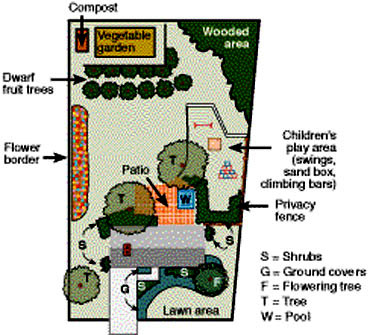 Figure 7
Complete the landscape plan by selecting the most suitable features from the sketches.
Framing the house
The most common approach to residential landscaping is to begin with the front landscaping and consider it as a frame for the house. Good landscaping can soften the house’s sharp corners and angles and help blend the man-made structure into its natural surroundings. This can be done most easily by planting large trees or shrubs on both sides of the house to focus the observer’s attention within its boundaries. Frame the house in this way by positioning progressively smaller plants closer to the front door to draw attention to the door and the route to it (Figure 8).
It is important to avoid placing large plants too close to the front door. Oversized plants can hide the entrance from view and cause confusion about how to get there. A visitor should be able to identify the entryway with ease. Also, large plants positioned too close to the doorway can make the entrance feel claustrophobic and unwelcoming.
 Figure 8
By placing progressively smaller plants near the door, the house is framed and attention is focused on the entryway.
Defining borders
On many residential sites, the house is placed in or near the middle of the lot and the front yard is an open, anonymous area of lawn. Most of the landscaping is placed directly in front of the house and does not extend much farther out than a few feet. This openness creates a lack of unity between the house and the rest of the lawn. In addition, the lack of defined borders or edges blends one front yard into the next, leaving the driveway as the only element dividing one property from the next.
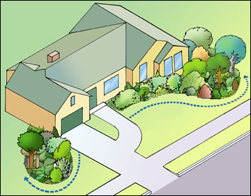
A simple way to integrate the planting close to the house with the lawn is to extend the planting bed several feet out into the yard. These beds flow most easily from the corners of the house, but need not be limited to that. Increasing the planting or paved area near the entryway can be visually effective and functional as well, as it allows several people to gather comfortably at the entrance. Extended beds may include trees and shrubs or may consist only of ground cover; any of these will help connect the house with the landscape (Figure 9).
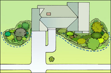 Figure 9
Extending plant beds from the corners of the house or increasing the paved area near an entrance can help connect the house visually with the landscape.
Material selection and use
Two categories of materials need to be considered when planning a landscape:
- Plant materials (“softscape”) consisting primarily of trees and shrubs
- Structural materials (“hardscape”), such as paving, fences and walls.
Plant materials
A common landscaping mistake is to scatter an assortment of unrelated plants in improper growing conditions. As a result, they probably will not develop properly and may even die. For example, placing a sun-loving plant in a shady location will result in a weak, spindly plant and eventually the death of that plant.
Try to select plants so the front yard has year-round interest. This is done by selecting plants with more than one season of interest. An ideal deciduous (non-evergreen) plant would have attractive foliage, spring or summer flowers, good autumn color and an interesting shape or branching habit. Aim for plants that have at least two seasons of interest. Evergreen plants are good to include because they help provide structure and color in the winter months when the deciduous trees are leafless. However, aim for a good balance, as a predominance of evergreens can make the landscape appear too dark and gloomy.
Many books and software programs list and categorize plants according to their design characteristics, best uses and cultural needs. Plants native to the area are a good choice for the landscape as they have naturally adapted to local conditions and look “at home” in the landscape.
Trees
Trees are the most permanent and dominant plants in the landscape. As they are the most important plants in the front yard, careful consideration should be given to their selection and placement. Trees can be used for framing the house, providing shade, adding height and interest to a shrub bed, or screening unwanted views. To maintain a unified and balanced appearance, choose trees to be compatible with the overall appearance you wish to achieve, whether formal or casual, traditional or modern. Also, select and position trees based on their eventual size at maturity. Trees planted behind the house and visible above the roof help to soften the roofline. Large shade trees are seldom appropriate in the front yard, however, as they dwarf most houses. Even small to medium-size trees need to be placed well away from the foundation of the house. A common mistake is to plant a young tree too close to the house, where it does not have the space to develop a proper shape. Further details for using trees in the landscape can be found in MU Extension publications G6810, Uncommon Trees for Specimen Planting, and G6900, Tree Placement on Home Grounds.
Shrubs
Along with trees, shrubs form the basis of the front yard plantings. Strive for a mix of deciduous, broadleaf evergreen and coniferous shrubs to provide interest year-round, but avoid using too many different varieties. How and where shrubs are positioned strongly affects their appearance. Avoid “dotting” them about the lawn, as this is visually distracting and makes lawn mowing much more difficult. Shrubs should be grouped together in beds or borders to maximize their effect. This grouping, or “massing” as it is often called, adds to the unity and improves the flow of the landscape. As plants merge together, the eye travels through the landscape more easily.
Once again, consider the mature size of the shrubs when planting. Plants should create a good mass without being overcrowded. Place shrubs so that they begin to merge together when they are approximately 70 percent of their mature size. Consult gardening books or a local nursery if you are unsure of mature size.
To improve the balance and appearance of massing, plant shrubs in odd numbers, such as three and five. Unless you are establishing a formal and symmetrical design, even numbers (such as two or four) tend to lessen the unity of the planting by visually splitting the eye. Adding a third or fifth plant causes the grouping to be viewed as a single mass. This is less important as the number of plants in a group gets larger, because the eye can no longer easily discern the number of plants in the grouping.
Also, if an informal look is desired, consider staggering the shrubs rather than placing them in a straight line. Staggering creates a more flowing appearance than a rigid row of plants and also enhances the effect of massing, making it more solid.
Hedges
Hedges are a special use of trees or shrubs, and one that requires particular thought and placement. If a hedge is desired for the front yard, determine its function. Hedges can be used to establish a boundary, provide privacy or screen an objectionable view. Consider how much maintenance different hedging plants will need. Clipped hedges create a formal appearance and require regular maintenance. Unclipped hedges are more informal but can easily look unkempt.
For safety, any grouping of plants, whether informal masses or hedges should stop 15 to 20 feet from the edge of the street. Plants placed closer than this distance to the street can block the driver’s view of the street from the car.
Turf
The lawn, while not an essential feature for the front yard, does function to connect all the landscaping elements. A well-maintained lawn can contribute to the overall curb appeal of the property. If a lawn is desired, its shape should be planned along with the rest of the landscape. The lawn should have a well-defined and simple shape. For ease of mowing, edges should be uncomplicated; curves are the easiest to mow along. The lawn should be as free as possible from obstacles, including trees, boulders and birdbaths. Site these within planted beds or borders. Also, lawn is not a good choice for the shady areas below trees or on steep slopes. Ground cover looks better and is easier to maintain in these areas.
Ground covers
Spreading plants that grow to a maximum height of one foot can be used in conjunction with the lawn or can serve as a lawn substitute. A bed of ground cover planted next to an area of lawn or pavement can imply an edge to the space. A continuous flow of ground cover can unify separate planting areas and help the eye flow easily through the landscape. For information on selecting ground covers, see MU Extension publication G6835, Selected Ground Covers for Missouri.
Flowers
Whether perennials, annuals or bulbs, flowers are often the most desired and the least effective in establishing curb appeal. As with any other type of plant, flowers call for careful placement within the landscape. Unless the house is truly an old-fashioned cottage and its inhabitants are avid gardeners, the idyllic cottage garden filled with an exuberance of flowering plants is not a good idea. Most perennials do not have a long bloom period and so are fairly uninteresting for the majority of the growing season and are totally absent in the winter. Annuals bloom longer through the summer months, but again, disappear with cold weather. Spring-flowering bulbs provide welcome spots of color after a long winter, but are by nature ephemeral and the dying foliage unattractive. They are better planted in the less public area of the property.
Used with restraint, flowers can be effective when planted at the foot of shrubs within borders (do not dot flowers between shrubs), or in containers near the entryway. The main purpose of flowers in the front yard should be to add a bit of color and interest. Choose a simple color scheme and keep to it. Two or three coordinating or contrasting colors are much more effective than a riot of color.
Flowers should not be the dominant feature of the landscaping. Do not scatter flowerbeds in the lawn, and do not use flowers to line the driveway. Beds in the lawn distract the attention from the intended focal point — the front door, and flowers (or any other plants) lining the drive call too much visual attention to the garage door. Consider flowers as the extra touch, an embellishment, rather than as an essential element in the design. Perhaps their best use is as space fillers while newly planted shrubs are growing to mature size.
Structural materials (hardscape)
The two most basic hardscape elements are the driveway and the entry walk, both usually are paved surfaces. When working with an existing house and yard, make sure to position these two elements accurately on the base plan. Then evaluate whether the drive and walk are serving their purpose effectively. When landscaping a new house, consider the following general guidelines.
Driveway
The primary purpose of the driveway is to provide space for car parking. The minimum functional width for a one-car drive is 10 feet. Evaluate the need to expand the parking area. If the driveway also functions as the walk from the road to the front door, the drive should be widened by at least 3 feet. Without the extra width, there is little room to walk when a car is parked on the drive. This forces people to walk around the car along the narrow edge or to step onto the adjacent lawn or planted area. A simple widening of the drive with a different paving material identifies that area as a pedestrian path and facilitates foot traffic to the entry.
Entry walk
When separate from the driveway, the entry walk provides access from the road or the driveway to the front door. It has three main functions:
- Providing a safe approach
- Guiding people through the landscape
- Influencing their view. Many entry walks are poorly designed and so do not function effectively
One of the most common problems is an entry walk that is too narrow. Typically, walks are only 3 feet wide, which forces people to walk single-file. To accommodate two people walking side-by-side, the walk must be at least 4 feet wide. Wheelchair access requires a width of 5 feet.
A related problem is the overgrown walk. Shrubs planted too close to the walk can reduce the available width and eventually cover the walk entirely. As in the selection of plant materials elsewhere in the landscape, mature size must be considered when positioning plants in relation to the entry walk.
Another problem is when an entry walk is not easily seen. This is particularly true where the walk connects to the driveway and there is nothing to indicate or call attention to the location of the walk. Thoughtful placement of plants can and should direct the eye to the entry route.
Visual interest is often lacking along the entry walk. An open expanse of lawn and a line of foundation plantings do not provide an especially stimulating view. The route to the front door can be developed so that it takes advantage of different views. The walk does not necessarily have to be a straight line. While the walk should be a direct one, a turn or two can add interest and allow you to vary the view on the way to the front door. Note, however, that there should be some physical reason for the path to curve, such as to go round a planting area or tree. Avoid purposeless curves, as they look artificial and without function.
Greeting area
The entry walk ends at the front door, often meeting a small concrete pad or stoop that serves as an outdoor foyer or greeting area. Typically, this space is too small to function well. It is so small that it does not allow people to stand on it while the storm or screen door is being opened without getting hit in the face or stepping away from the door. Consider enlarging this area of paving to accommodate at least two or three people comfortably.
It is also desirable to provide some type of protection from the elements. The overhead protection of a porch gives shelter from the rain. Also consider creating a feeling of semiprivacy at the entryway. A sense of enclosure can be provided by planting along the sides. However, be aware of plant sizes and positioning — do not make the mistake of screening the front door so that it is not visible from the road.
Paving materials
When choosing paving materials for the driveway, entry walk and greeting area, the two main factors to consider are cost and appearance. Concrete is the most commonly used material. While it is relatively inexpensive, it is rarely the most attractive option. Many different types of paving materials are available and can used to add distinction to the landscape and increase the curb appeal of the property.
Use the architectural character and building materials of your house to help you select appropriate paving materials. If your house is made of brick, stone or wood, try to incorporate the same materials in the landscape hardscaping. This increases the appearance of unity in the landscape.
Brick is an attractive paving option and can be used for all paved surfaces. The color and texture of bricks impart visual warmth to the landscape and are appropriate for both formal and informal styles. Bricks also add visual interest to the ground surface. They can be laid in any of several patterns or can be used in conjunction with other paving materials.
Manufactured pavers and tiles can be used in the same way as brick and are usually a less expensive option. Pavers are readily available and some are quite attractive. Stone is a good choice for foot traffic and is particularly well suited to an informal appearance. Many different types and categories of stone are available. For the most natural look, choose stone that is locally quarried or compatible in appearance with local stone. Stone is usually not a good choice for driveways unless it is cut thick and laid on a stable base.
Wood has an appealing natural color and texture. It is best suited for walks and entry areas with an informal, rustic or modern character. Wood is a versatile material and can be stained or painted to blend in with house materials. Like stone, it is not suitable for drives.
Other paving options include gravel, concrete and asphalt. Gravel can be attractive and provides an interesting texture underfoot, but it must be contained with some type of edging material. Concrete can be a good choice for areas that are curvilinear or irregular since it conforms to any shape. Asphalt is too utilitarian to be used in the front yard if it can be avoided.
Landscape accents
Accent features (which include specimen plants) act as focal points or “visual magnets” to draw the attention of the viewer. As such, they should be considered as embellishments and used with restraint or not at all. Items such as gazing balls, sundials, birdbaths, obelisks and statuary tend to distract the eye and lessen the unity and balance of the front yard. If you enjoy such decorative items, they are more appropriately positioned in the private area of back yard.
A specimen plant is a tree or shrub used as a focal point because of its outstanding ornamental characteristics. By its very nature, such a plant draws attention to itself. The difficulty in using a specimen plant in the front yard is that it too easily becomes the primary focal point, drawing attention away from the front door. To avoid this, any specimen plant should be positioned near the door, so that the eye is led naturally from the plant to the door.
Do not use more than one specimen tree in the front garden. Two or more will compete with each other and the house. Also, choose a plant that is not overly dominant. For example, the Colorado blue spruce is one of the most popular specimen plants sold. However, it is a strong accent and cannot be placed near the house or doorway because of its large size at maturity, so it inevitably disrupts the unity and balance of the landscape. A small tree or shrub with showy spring flowers or autumn color would be a more appropriate and effective choice.
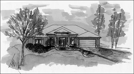 Figure 10
An attractive landscape is the result of careful planning and application of landscape design principles.
(Illustration courtesy of Tim Maloney)
Summary
Remember, your residential landscape gives visitors their first impression of you and your home. By following the guidelines outlined above, you can create a landscape with strong curb appeal: one that is unified, balanced, in harmony with the house and the neighborhood and, at the same time, a unique reflection of you and your lifestyle.